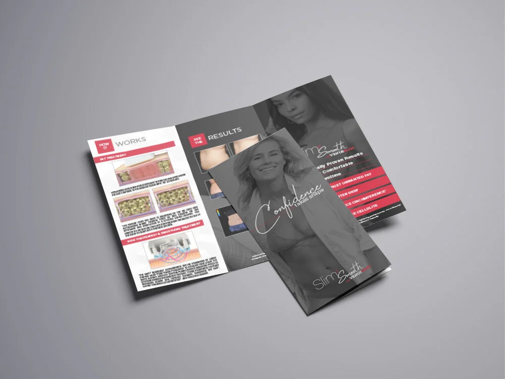
Venus Concept - B2C Tri-fold Brochure Refresh
Art Direction + Final Design - Dustin Hatcher
Copy - Ben Laun, Senior Copywriter
Brand Art (Venus Bliss) - Alyvia Wright, Junior Graphic Designer
Corporate Brochure Design
Concept + Creative + Final - Dustin Hatcher
8 revisions with executive team. Plus the addition of a 6 panel foldout brochure for a more simplified leave behind aesthetic device only version. (seen at bottom)
Venus Heal Video Production
Creative Director - Chad Brophy
EP - William Boyer, Fresh Content
Art Director, Video & Photography/Talent Recruit/Video Graphics/Brand Art Concepts - Dustin Hatcher
Full video & photography production on location at Staxx, in Charlotte, NC. I started out the process with brand art concept creation. After approval of video direction, I helped in reworking the video script with the Creative Director, preparing all story boards, setting up the shot list for video and photo, acquiring talent, and art directing during the production. I was also an instrumental part in the post stages of editing along with the Creative Director and EP.
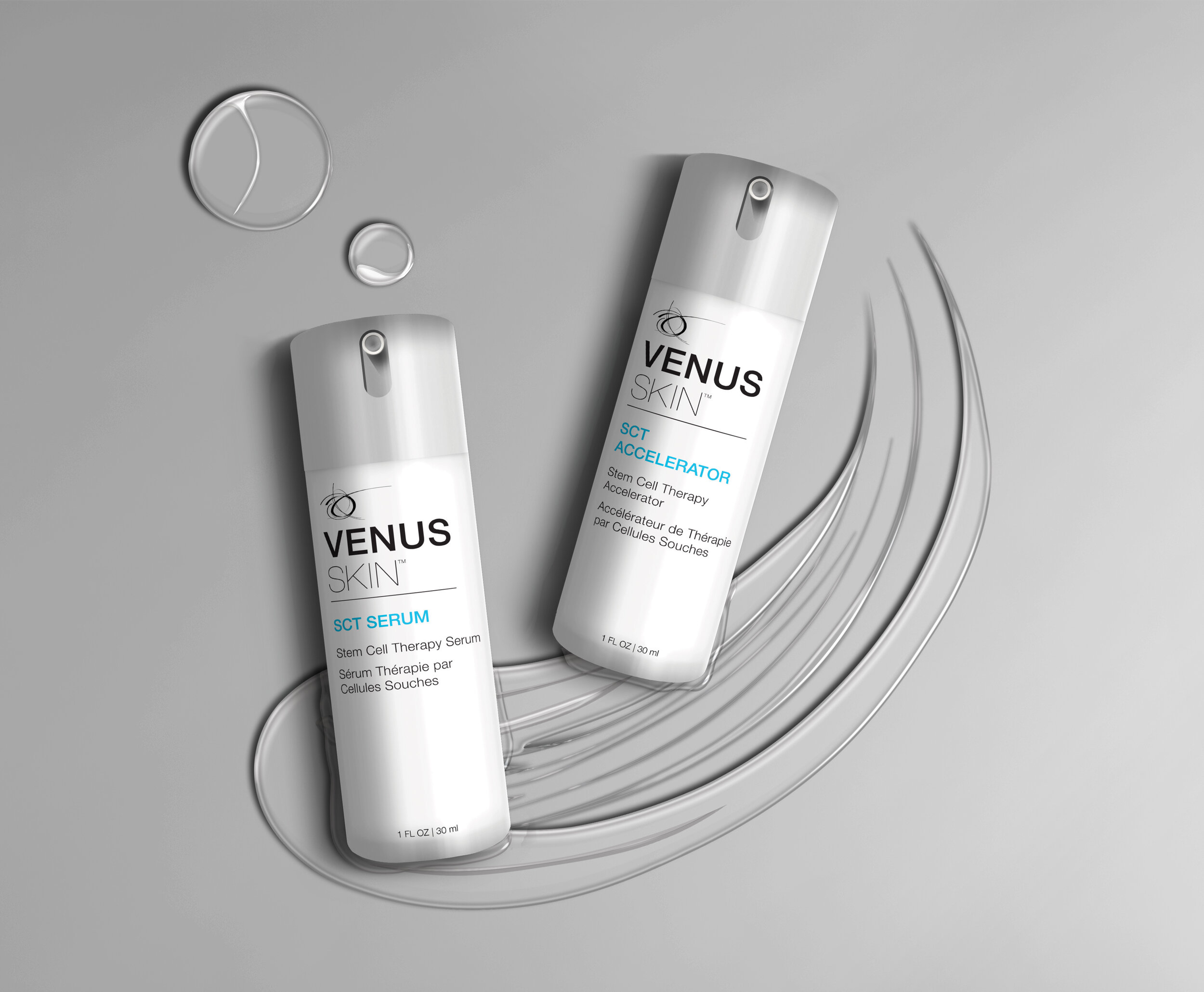
VenusSkin Asset Rebrand
Creative & Art Direction - Dustin Hatcher
Liquid design work - Anna Rissanan, Junior Graphic Designer
Every designer is tired of the floating products in ads and on their assets. So, the project was tasked to come up with a creative direction to solve that problem with our retail line of skincare products.
The Process - Adams Outdoor
See how the concept and execution comes together.
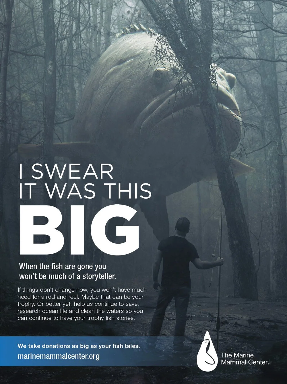
The Marine Mammal Center
Spec Ads - Graduate Program
We explored testimonial type ads for our non-profit groups. These are ads from the Effective Copywriting class. All headlines, subheads and body copy written by me (except for the adoption ad body copy). All images are from Adobe Stock.
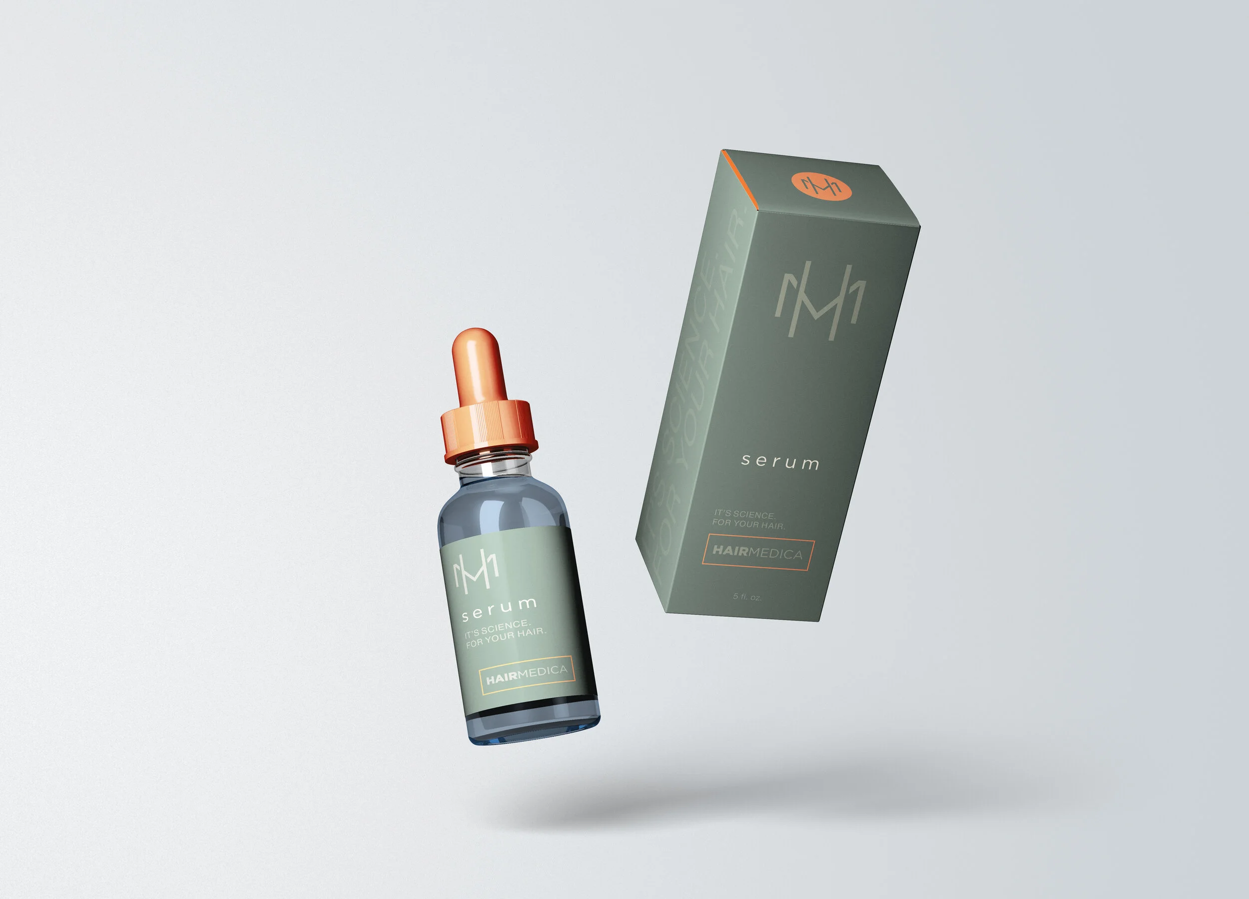
HairMedica Packaging + Hair360 Logo Concepts
Creative Direction + Design - Dustin Hatcher
As a complement to our new hair vertical, Hair360, it was tasked to brand our new line of hair care products for use before and after a hair transplant procedure. Along with this was creating logo concepts for Hair360.
B2B Product Brochure - Refresh Design
Creative Direction + Design - Dustin Hatcher
Everything needs a little facelift, ever so often. The product brochures had seen the same design and layout for several years, with little, to no visual design direction given to them in the past. I was tasked with coming up with a new layout, that was both visually interesting, and not a common technical visual that doctors would see as they tend to do with most other device companies. All while adhering to the individual device brands, and making them more cohesive and consistent across all B2B assets.
Glow Device Venus Serums
Creative Direction + Design - Dustin Hatcher
Tasked with coordinating with device brand colors for the serums to add into the facial treatment solutions. This included labeling for the vials, and box packaging for the vials.
Venus Glow Brand Art Concepts
Art Direction - Dustin Hatcher
Copy - Ben Laun, Senior Copywriter
Layout - Alyvia Wright, Junior Graphic Designer
Conbraco Industries / Apollo Valves
Refresh of brand to include all four companies under Aalberts Corporation. Worked on building a cohesive brand solution from stationery to ads to our extensive line of catalogs. Was the Creative Manager under the Marketing Director to lead all projects with a team of 2 designers, 1 videographer, 1 social media manager, and 1 events coordinator.
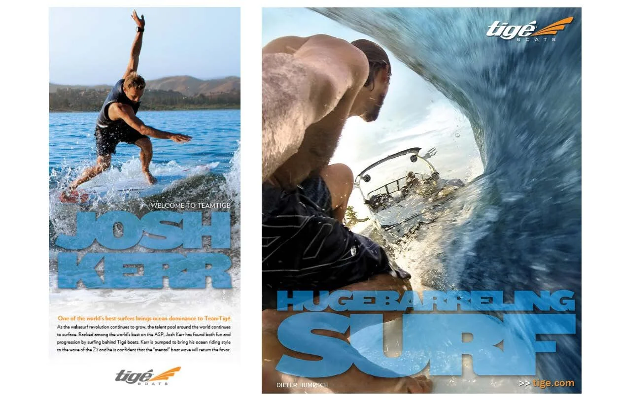
Tige Boats + Indmar Marine Engines
Responsible for the concept and design of new Apex Series Logo (ASR). Lead design/branding for Endless Wave Tour 2014, which included logo design, social media strategy/design, website layout, POP materials & Championship Award designs. Crucial in implementing all materials needed for current ad campaigns running in national magazines and in the execution of the final designs. Lead design with direction from Dept. Director on current MyWake Competition website redesign and brand campaign strategy/designs. With direction/team collaboration, helped lead the event planning/staging for ASR release in October 2013. Designed all new dealer POP materials for 2014 year boat shows. Lead director for 2015 Catalog studio photoshoot. Procured new photographer, set shot list and helped lead direction for implementation of images on website and future catalog.
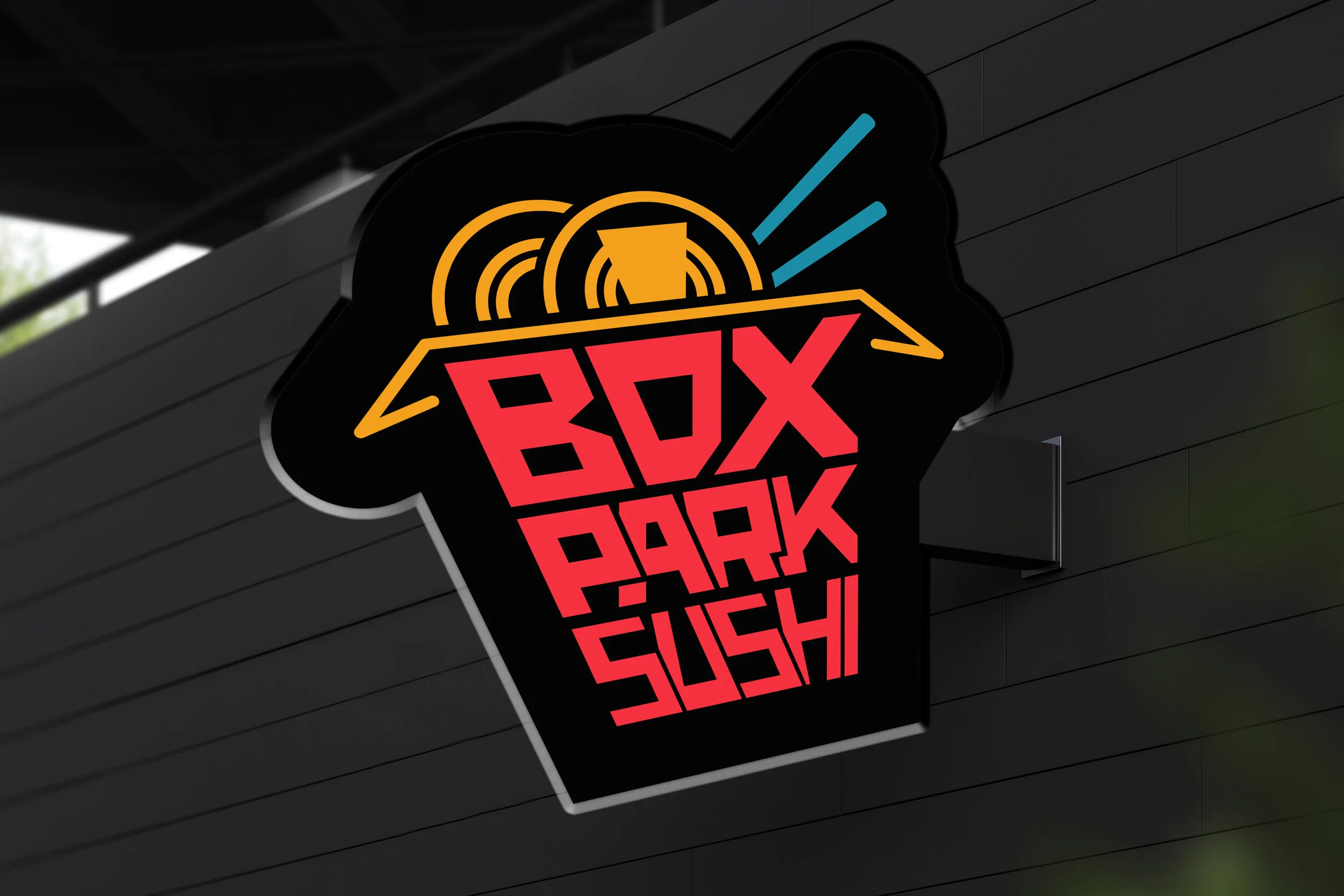
Boxpark Sushi
Logo Design & Brand Guide Development
Initially the problem was in the refinement of the logo concept. Taking simple shapes and empty space the idea was formed to use a Chinese takeout box, which in some aspect is ironic in this scenario, and fill the voids with the actual name. After doing some hand sketching and line drawing with the ruler, I went to the computer to refine the design. After several failed attempts at using hand drawn lettering a system font was placed in for the text. But therein lied the problem, it didn’t feel organic and definitely not unique or memorable. Again I set out with pencil and paper to try again. As a system font was not suitable for the tone and voice of the brand. Doing more research and finding more inspiration for text, overlays, hidden structures, and text logos the hand drawn type was the direction that needed to be taken. Think about how it would be interpreted if initially it was sent to you for review not as the designer (Stevens, 2020). This took the process to making one letter at a time and seeing how not only it fit in the box, but how they fit, or interacted with the letter before and after it. The shapes, how they fit and the custom, organic feel made it far more interesting than that of any system font I could have used.
When done and comparing to other establishments in the area, they would only then compare in services and products. The style, colors, and custom look of the logo using the techniques learned and research gathered along the way completely separated it from the competition and other sushi establishments.
The brand guide had similar problems along the way, as it started out much too simple, and I tried to follow too many elements from the vision board, which was created well before any assets were even to begin concept. After taking the initial sketches and layouts, they were then mocked up in real life scenarios, where you could see how they actually worked and what needed to be tweaked. At this point creative had only been one piece of the the puzzle (Lang, 2020). The execution had to reflect the guide as being a piece of communication, and not thought of as an advertisement for the brand. It still could be creative and designed, but in a way that would tell people how, when and why to use the brand and the assets (Ray, 2019). And even though much could be written about the process involved, what could or should be included, it was important to stick to the essentials, which mostly entailed the visuals of the brand.
SPORTS 603 from the NJ Lottery
Develop a digital presence for a new game launching through the New Jersey Lottery. Sports focused, visually creative, attention grabbing.